It finally came down to the last day of research yesterday, only one more full day to go! Throughout the trip, as you know, we have all been doing work towards our own personal research topics as well as an overarching topic of printmaking in South Korea. Every day so far has worked itself into someone’s research and we have been working full steam ahead to make sure that we can learn as much as possible in our short three weeks! It has been an amazing experience, and the last day and a half will be a bit of a break from all of our hard work. I didn’t log on to write about the break (yet) but to tell you about the fruits of yesterday’s labor as our last day on the field!
We got a late start yesterday, giving us a little extra time to sleep in and prepare for the day ahead of us. We left at noon to go back to visit our friend Nam ChunWoo sunsaengnim where he was holding a woodblock demonstration in his Print Research Center. In case you don’t remember this visit you can always revisit this adventure:
https://hellojenna.wordpress.com/2013/05/16/gangnam-style-school-festival/
There’s Nam sunsaengnim in case you’ve already forgotten his face! The demonstration was done by a woman who specialized in traditional Japanese Ukiyo-e techniques, and was currently using her prints to raise money for an organization promoting education in Africa. Talk about using printmaking to be responsibly engaged in the world (a shout out to you Concordia, I saw some BREWing taking place!) Anyways, I took like a bijillion pictures of her process, but through a freak camera accident I no longer have any of them! Augh! So frustrating! She obviously gave her presentation in Korean, but Nam sunsaengnim translated a hand out for us giving us the specifics of her technique. I haven’t been passed the handout yet, so I’ll just give you my quick rundown of the process!
She uses a water based ink, and I believe she mixes it with a sort of watercolor. (all the details of her ink recipe are on the aforementioned handout). She works with both wet and dry paper, as each technique gives a slightly different appearance. Using dry paper allows the ink to absorb more on the surface, and gives a rich, punchy color. Using dry paper is best when you have strong lines or extreme colors that you want to stand out on the paper. She also uses wet paper, which allows the color to soak in deeper, and provides a soft, watercolor like appearance. For the demonstration she used wet paper, which she sprayed with water, layered it between newspaper and sprayed again, and then put the whole little package in a sealed bag. She also had a variety of different brushes that she got from Japan and this handy little hand-press thingamabob that looks like a hand sized disk about 1/8 of an inch thick with slightly protruding metal orbs on one side. The other side has a handle so you can push down on the little guy and get even pressure as you move it over your image. Heidi says we have one in the studio, but it’s rather poor quality.
She started by wetting down the back of her woodblock, so that it wouldn’t move around. I thought that this was a pretty clever idea, especially if you’re going to be hand-printing and not using a press! She then wet the area she was going to print by spraying it with water and dabbing off any standing water with a towel. Using one of her brushes she applied the lightest color to the area that she wanted to be that color. She made use of selective inking which I think is much easier!! In order to make an ombre effect she dabbed the paint thickly in one place and then using another brush and some water she smudged the ink around so that it would go from a very rich color to a very soft one. After the block was sufficiently inked she pulled out her paper and rolled it onto the block using an interesting registration technique that I didn’t really get to see. After the paper was securely on the woodblock she put a piece of parchment paper on top of it and went to town using the little hand-printing thing. She moved it around rather quickly, attempting to put the same amount of pressure in every part of the image. She checked it a few times, added more ink in necessary and continued to push. Once she was satisfied with the color she removed it and put it back in between the newspapers. She was using multiple blocks so she just grabbed her next color block and repeated the process over again to print the next darkest color on top.
She also had a new and more innovative technique that she used in order to print thinner lines and dark blacks. She drew into the woodblock like a copper plate and ten put some sort of chemical on the wood that she didn’t want to print. Whatever it was that she put on the block made it so that the ink wouldn’t stick there and she could with away those places before she printed. That way she was able to use her woodblock to print intaglio style! I’m not sure EXACTLY how it works, but it was pretty cool!
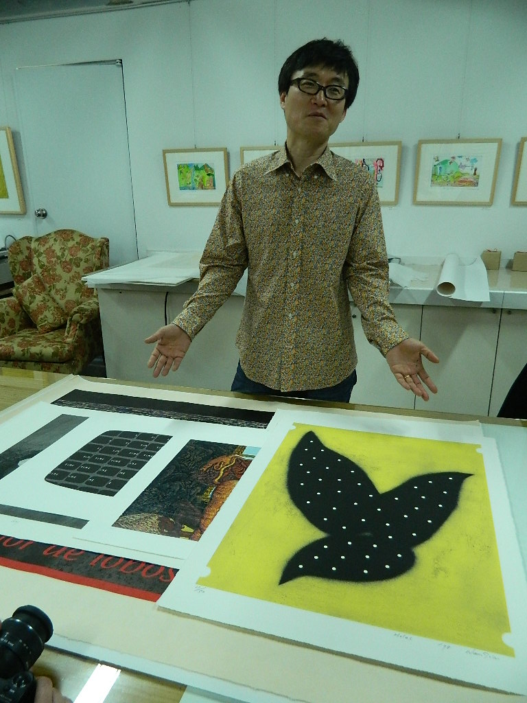
It was really nice of Nam Sunsaengnim to invite us to this demo, and you can tell that he was doing everything in his power to foster the love of printmaking! He had books everywhere for people to see, chatted excitedly with all of the teachers and students that were crowded into the studio, and went to the effort to translate what the speaker was saying for us! I asked him how often he had these demos, and if they would still be going on two years from now when I graduate (in case I come back to teach) and he told me that he’d be glad to have me, and that it was important that I still make prints while teaching!
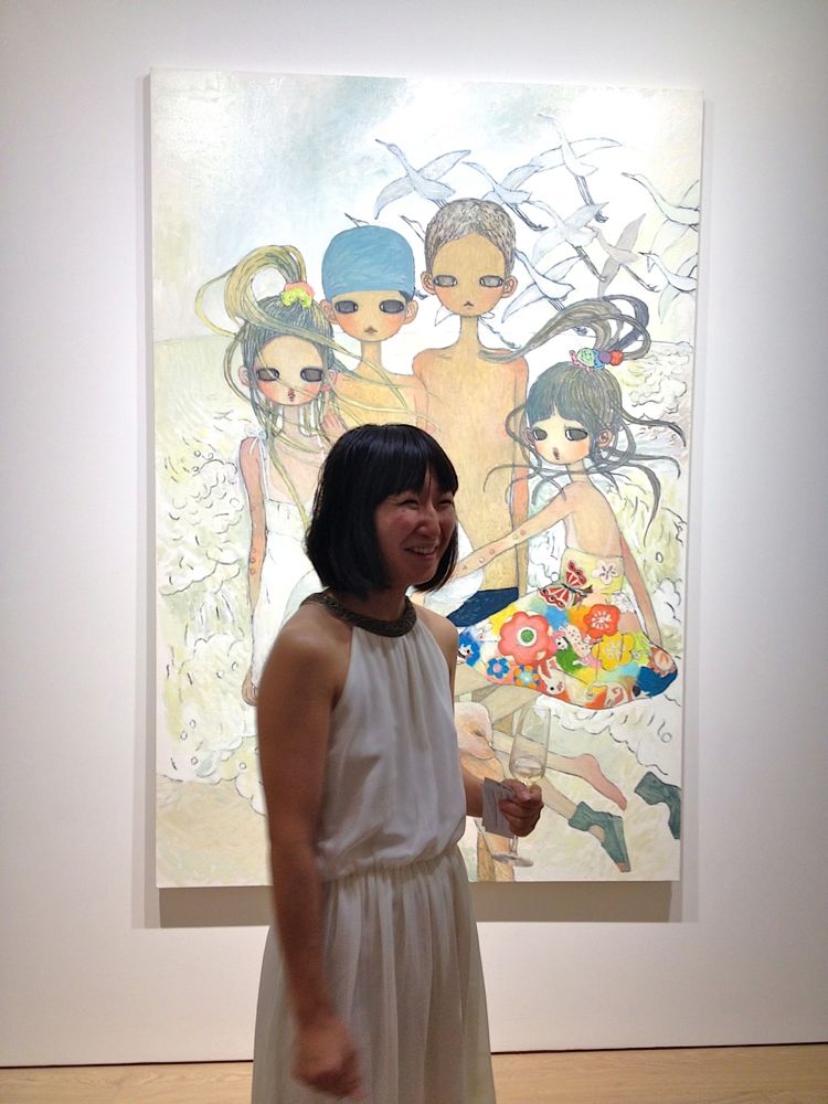
After visiting the Print Research center we went to the Seoul Arts Center to see a new exhibition and meet another contact of Heidi’s. It was a graphic arts exhibition, and it was jam packed with young artists trying to promote themselves. I have to say, out of all the galleries and museums that we’ve looked at I think this one was the most enjoyable, and the most relate able to my topic! Again, not all of my pictures saved, but I do have a few of them to share with you! There were a lot of young artists working with the cute aesthetic that I am researching, which is good because a lot of the older generation are trying to stick to more traditional works. That’s good too of course, but not as helpful to my research 😉

I picked up a LOT of business cards, and I am thinking that I might work with Susan to send them some email questions that I can use for my research. Just some questions about their aesthetic, if they perceive it as “cute”, if cuteness was a conscious decision, and something about the love of cuteness in Korean society. I have a 19 hour plane ride to think of questions tomorrow, so I’ll get things straightened out soon enough! I also noticed the use of quite a few “characters” meaning that the landscapes and imagery would change, but there was a re-occuring figure or character that the audience could relate to. This seems to be popular with Koreans, as I have seen even just coffee shops who have a little character logo that occurs throughout the cafe, or Subway characters, bus characters, and other assorted friends like Rilakuma who seems to be everywhere! Here are a few of the galleries who had a specific “character” in their work.


The use of this character is a really interesting way to capture your audience, and it really makes you become attached to their work! for example, I really love Hello Kitty so if I see a coffee mug with little flowers on it it’s cute but I already have a lot of coffee mugs so I don’t care too much. If I see the same mug with little flowers AND Hello Kitty it’s much more loveable because I can connect to the art through Hello Kitty. Making use of a character like this could potentially be the way that these artists are attempting to bring you closer to their work. You want to follow the little character you know and love, and see what adventures they come across next!! Anyways, my favorite booth at the fair made use of a character like this, and also had some really cute bunnies and BEAUTIFUL work! Here are a few pictures of her section.


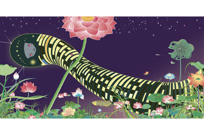
Stunning right? All of this thoughts on characters made me realize that most of the artists I have been studying have a character of some sort. Although Kwon Ki Soo is upset that Dongguri is being viewed that way the public certainly sees Dongguri as a character. Other artists like Art Nom, Takahashi Murakami, and Nara all have “characters” that live within the space of their work. Maybe THIS is the key to their popularity with the Korean public. If, as my research has been indicating, Koreans are desperate for a Korean identity perhaps they are looking to these characters to give them a Korean identity. One that is soft, and kind, and can take them away from the real stress of Korean society. These characters represent an ideal through which they can live an alternate life in the worlds that are created by these artists. The use of characters could also go back to the idea of lonliness that many of the artists discussed, and perhaps these characters can be taken as a friend, someone who is also all alone but never upset.
Oh man guys, research epiphany.